 Save to Pinterest
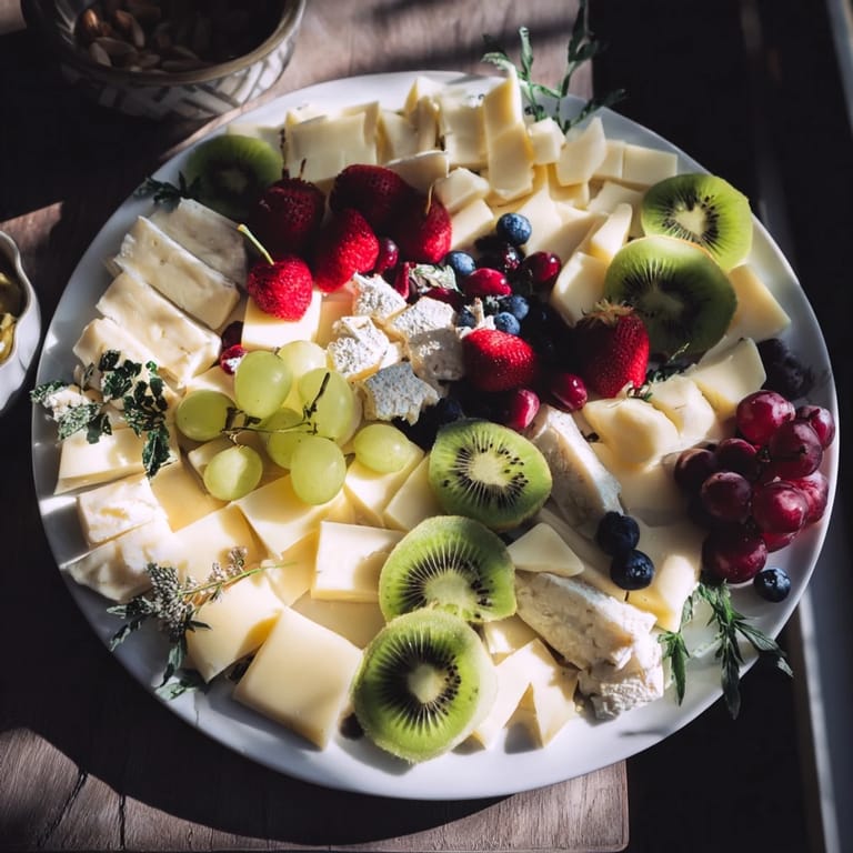
 I still remember the moment I saw a platter designed with negative space at an art gallery's opening reception. The food wasn't just arranged—it was composed, like the negative space in an abstract painting held as much visual importance as the subjects themselves. I became obsessed with recreating that magic at home, discovering that the kitchen could be just as much a canvas as a studio. Now, whenever I'm planning a special gathering, I sketch designs on parchment and arrange ingredients like I'm painting with flavors and colors.
I made this for my sister's engagement party last spring, and I'll never forget how she walked into the kitchen, stopped dead, and just stared. The negative space formed her and her fiancé's initials intertwined like a monogram. Everyone gathered around before touching a single grape, and for those few minutes, the platter wasn't food—it was a love letter made of cheese and fruit. That's when I understood the real power of this recipe.
Ingredients
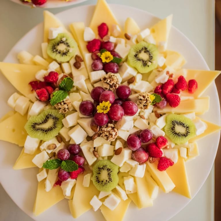
- Brie cheese, sliced (100 g): Creamy, approachable, and forms beautiful soft blocks that fill in larger areas of your design. I learned to slice it just before assembling so it stays firm and doesn't slide around on the board.
- Manchego cheese, sliced (100 g): This Spanish beauty adds a pale golden color that creates stunning contrast, especially when your negative space design uses darker ingredients as framing. Its semi-firm texture makes it easy to position precisely.
- Goat cheese, crumbled (100 g): The texture of crumbled goat cheese is a game-changer for filling curves and creating soft transitions between colors. It's also forgiving if your arrangement isn't perfectly geometric.
- Seedless red grapes (1 cup): These are your color jewels—bright ruby red against the whites and golds of the cheeses. Their round shape naturally guides the eye along your design's edges.
- Strawberries, halved (1 cup): Pink-red berries add height variation and their heart shape creates natural visual momentum. Slice them as close to serving as possible to prevent weeping.
- Kiwi, sliced (1 kiwi): The bright green interior is almost neon and becomes your most luminous accent color. It photographs beautifully and adds a tropical freshness that feels elegant.
- Blueberries (1/2 cup): These dark purple berries are invaluable for creating shadow and definition in your negative space—they make the design pop by providing the darkest color contrast on the board.
- Thin crackers (12): Choose something neutral in color so they don't compete with your design. I prefer water crackers or simple wheat varieties that stay crisp and don't have too strong a flavor.
- Roasted almonds (1/2 cup): Their irregular, bumpy texture adds tactile interest and warm beige tones that ground the brighter fruit colors. Roasted means they're already flavorful and won't taste raw or bland.
- Green olives, pitted (1/4 cup): The deep green provides subtle color variation and their small size makes them perfect for filling tiny gaps in your design. Pitting them beforehand prevents guests from awkward discoveries.
- Fresh mint leaves (for decoration): Beyond garnish, mint adds a whisper of color and signals freshness. It's the last flourish that makes everything feel intentional and sophisticated.
- Edible flowers (optional): If you use these, choose ones with strong color—pansies, violas, or nasturtiums. They're pure decoration but they transform the platter from impressive to museum-worthy.
Tired of Takeout? 🥡
Get 10 meals you can make faster than delivery arrives. Seriously.
One email. No spam. Unsubscribe anytime.
Instructions
- Design Your Masterpiece:
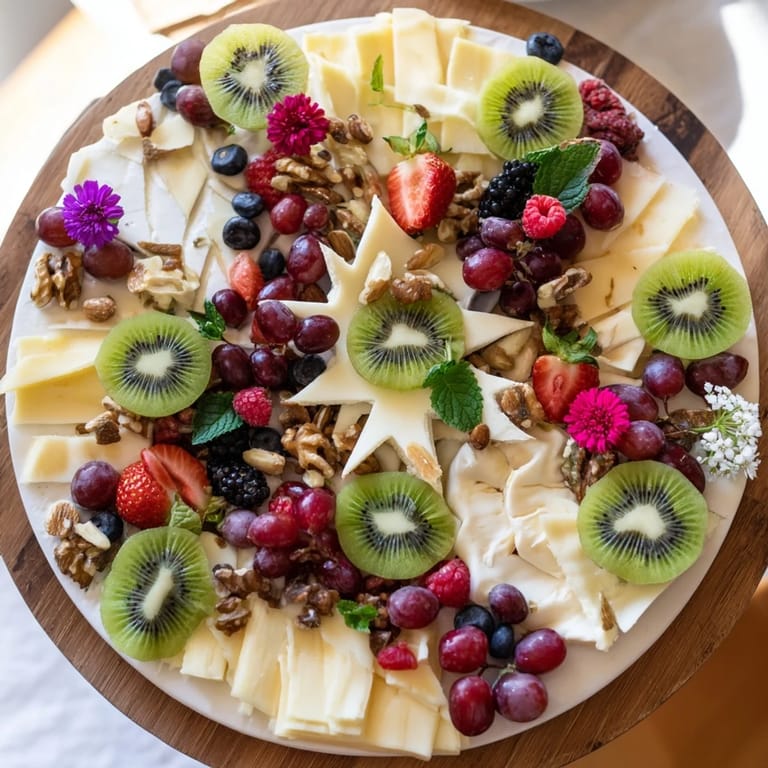
- Sketch your negative space shape directly onto parchment paper using a pencil. Think about what would mean something to your guests—a star for celebration, initials for intimacy, a heart, a leaf, whatever feels right. Make your shape large enough to be immediately recognizable but not so huge that you run out of ingredients. I usually aim for something that takes up about one-third of my platter.
- Set Your Guide:
- Place the parchment paper on your serving platter, pencil design facing up. This becomes your roadmap. The parchment won't stain the food and creates a temporary boundary that keeps everything organized while you work.
- Build Your Frame:
- Start arranging your cheeses and crackers in clusters around the outline of your negative space, working as if you're creating a border. Position the crackers at angles—some standing, some lying flat—so they create dynamic visual interest. The Manchego and Brie should go down first as they're your anchor pieces, with goat cheese filling in the softer transitions between them.
- Paint With Color:
- Now comes the meditative part. Fill the spaces between your cheese and cracker clusters with fruit, treating each piece like a brushstroke. Start with your strawberry halves, arranging them so the pink interior faces up. Add red grapes in small clusters, letting them nestle naturally. The kiwi slices become your brightest accent—scatter them with intention, knowing their electric green will draw the eye.
- Layer Your Textures:
- Distribute blueberries strategically along the edges of your design, letting them create shadow and definition. They're your darkest color and they anchor everything visually. Sprinkle almonds in small piles between the fruit, creating pockets of texture that catch light differently. The olives go in similarly small clusters—they're supporting players, not stars.
- Reveal Your Art:
- Take a breath, then carefully lift away the parchment paper. Slide it out slowly so nothing shifts. This is the satisfying moment—suddenly the negative space emerges, clean and defined, and all your careful arrangement makes sense as a complete composition.
- The Finishing Touch:
- Scatter fresh mint leaves across the platter—some in the negative space itself, some among the ingredients. If you're using edible flowers, position them where they create visual impact without covering your design. Step back and look. Does it feel balanced? Is the negative space clear and striking? This is your chance to make small adjustments before guests arrive.
- The Reveal:
- Bring the platter out and enjoy the pause before people dive in. Encourage everyone to admire it first—take a photo, let it be art before it becomes sustenance. That moment of appreciation transforms the whole experience.
 Save to Pinterest
 What surprised me most about making these platters wasn't the visual impact, though that's extraordinary. It was how the act of creating it together with friends turned into its own kind of gathering—someone would suggest a different arrangement, we'd try it, laugh at the results, adjust again. The platter became less about perfection and more about the conversation and connection happening around it. That's when I realized this recipe isn't really about negative space at all. It's about creating moments.
Flavor Building: Savory vs. Sweet
The magic of this recipe is that it works equally beautifully as either a sophisticated appetizer or an elegant dessert, and the transformation is simpler than you'd think. For the savory version, the combination of creamy cheeses, crisp crackers, and bright fresh fruit creates a balance where no single flavor dominates—everything supports and enhances everything else. The almonds add earthiness, the olives bring a salty note, and the fruit cuts through richness with acidity and natural sweetness. It's what makes the platter so craveable; you take a bite of several things at once and discover new flavor combinations with each forkful. For a dessert iteration, simply swap the cheeses for good quality dark chocolate shards or truffles, replace crackers with biscotti or almond thins, and substitute grapes and olives with dried apricots, dried figs, or candied citrus peel. The fruit stays—strawberries and kiwi work beautifully in either version, actually creating a bridge between savory and sweet approaches.
Making This Your Own: Personalization Ideas
The framework of this recipe is actually just scaffolding for your creativity. Once you understand the principle—ingredients arranged to frame a striking negative space—you can adapt it endlessly based on what you have on hand, what's in season, or what would mean something special to your specific gathering. Think about the occasion and what shape or symbol would resonate. A corporate event might feature a company logo or initials of the honoree. A baby shower could showcase a stroller or baby carriage silhouette. An anniversary celebration might feature intertwined hearts or rings. The ingredients can shift seasonally too—summer means fresh berries and stone fruits, winter might feature pomegranate seeds, persimmons, and nuts. You could lean heavily into a color palette that matches your table's aesthetic, using only warm colors one time and cool colors the next. Some of my favorite adaptations have happened when I worked with what farmers markets had that week, forcing me to be more creative than I otherwise would have been.
The Secret to Keeping Everything Looking Fresh
The enemy of this platter is time. Fresh fruit oxidizes, cheese begins to sweat, and everything loses its crisp visual appeal if you assemble too far in advance. I've learned to work backwards from serving time—construct the whole platter no more than 2 hours before guests arrive, and ideally within the 30-90 minute window before serving. Prep all your ingredients the night before if you want, but hold the final assembly. Keep everything chilled until the moment you set the platter out. Some people worry about the negative space filling in as guests eat, but honestly, that's part of the beauty—the platter evolves throughout the gathering, becoming more organic and less geometric. It actually becomes more approachable as it looks less precious. One trick I've used is to lightly spray the fruit with a fine mist of water 10 minutes before serving—it makes everything gleam and look garden-fresh, though be careful not to soak the crackers. The negative space itself stays pure if you don't let people absentmindedly pick at it; one person will respect the design once they realize it's intentional art.
- Assemble no more than 2 hours before serving for maximum visual impact.
- Keep cheese slices cool right up until the last moment to prevent them from looking oily or sad.
- A light water spray 10 minutes before serving makes everything look just-picked and luminous.
 Save to Pinterest
 Every time I make this platter, I'm reminded that food can be so much more than sustenance. It can be conversation starter, gesture of care, and small declaration that this gathering matters enough to create something beautiful. That's the real recipe.
Questions & Answers
- → What is negative space arranging in this platter?
Negative space arranging involves placing ingredients strategically to create empty shapes or patterns on the platter, highlighting the visual design between food clusters.
- → How can I maintain the shape while arranging ingredients?
Using parchment paper with a sketched design beneath the platter helps guide the placement and keeps the negative space clear and precise.
- → Can this platter be made gluten-free?
Yes, substituting regular crackers with gluten-free options ensures it suits gluten-sensitive diets without compromising texture or flavor.
- → What variations can I try for a dessert-themed version?
Switch cheeses and crackers for chocolates, biscotti, and dried fruits to create a sweet-themed arrangement with similar visual appeal.
- → What are good pairings for this platter?
Sparkling wine or a crisp white wine complement the flavors and enhance the experience alongside the assorted cheeses, fruits, and nuts.